 From the first installment of Why They Work.
As of the time I’m writing this, there are over 14,800 posts in the #watchstudies community. First of all, hot damn! Second of all, the quality of work across this community is getting SO good.
Now, there are many things that go into making a good photo good. Some of these things are obvious (good lighting, balanced composition, to name a few), while some of them fly a little under the radar but trigger the heart eyes emojis just the same. But it’s by studying both the obvious and unobvious that we can learn to harness their power in our own photographic arsenal.
Almost one year ago to the day, I posted the first Why They Work tutorial with this in mind. Today, I thought it’d be fun to do a part 2, this time using three of my recent favorites from the #watchstudies tag and focusing specifically on some of the quieter details that make a loud impact. Enjoy!
This week's challenge
Let's see you put the 3 techniques from this tutorial into practice! Or, better yet, share some of the subtle details you employ to take your shots to the next level. Don't forget to tag your posts with #watchstudies to inspire the community!
Visual anchoring
This first example is from the legendary @m.adcock81 (who just surpassed 10K followers – congrats!). I love the earthy and almost monochromatic tones of this shot and how balanced the composition feels. But only when I looked a little closer did I realize why this shot stood out to me.

What hit me immediately when I studied this photo a bit more was the way textures and colors anchor the extremities of the photo. The first example of this is between the sleeve of the sweater and the hat in the top left.

The second example of this anchoring effect is between a trio of warm tones in the remaining corners: the lip of the coffee mug, neck of the coffee carafe, and coaster.

It’s the placement of these visually-related items around the perimeter of the focal point that gives this photo a really grounded sense of balance. The visual weight of all the supporting elements feel uniform, and the narrative across the props feel intertwined. This in turn lets the hero – the watch – truly shine.
Leading the way
This next example comes from the always cinematic @the_vintage_guy and is a wonderful testament to the power of directionality.

Here, the natural bend of the arm leading to the watch already offers a clear path for the eyes to follow. But it’s the ribbed lines of the sweater, both down the subject’s arm and his body, that really drive the effect home. Even with so many beautiful details across the photo, it’s almost impossible to not look at the watch first.

But there’s one other subliminal detail here too – the gaze of the subject points directly down to the watch (or the bag, which crosses perfectly through the watch). We don’t see faces often in watch photography, but the direction in which a subject is looking is typically a strong indicator of where the viewer should look too.

Along with the moody lighting, rich tones, and even subtle sub-framing between the bag’s handles, there’s a whole lot to love about this shot.
Telling the whole story
I’m a big fan of the #sweatpantspocketshot crew. Not only because of their prioritization of comfort but because nobody makes sweats look good like they do. I believe @a_watchguys_life deserves the credit for the patented cozy look, but this example from the also brilliant @herrstilen stood out in the #watchsudies feed.

The game changing detail in this shot is one that isn’t embraced often enough: the watch – or dial specifically – is not centered in the composition. Always centering the dial of a watch is by far the most common mistake I see across watch photography. Yes, our photos are about watches, and yes the dial is the most important part of a watch, but no, the dial does not have to always be centered!

Photography is about telling a story. And while there is always a main character in every story, the story can only be told effectively when the entire cast is considered. In this photo, if the watch had been centered, we’d see equal parts arm and thigh. But the reality is, the arm is more valuable to the photo because it carries the watch (literally and figuratively) and contextualizes the pocket shot. Going back to the metaphor, the arm is more important to the story than the thigh (this is a very strange story).

The other reason why this framing is more effective is because it takes into account the other hand that’s in the frame. Visually, the skin tones here are very pronounced, so to achieve a more balanced composition, both hands needed to be considered. Had the watch been centered, the composition would have felt a little top heavy.
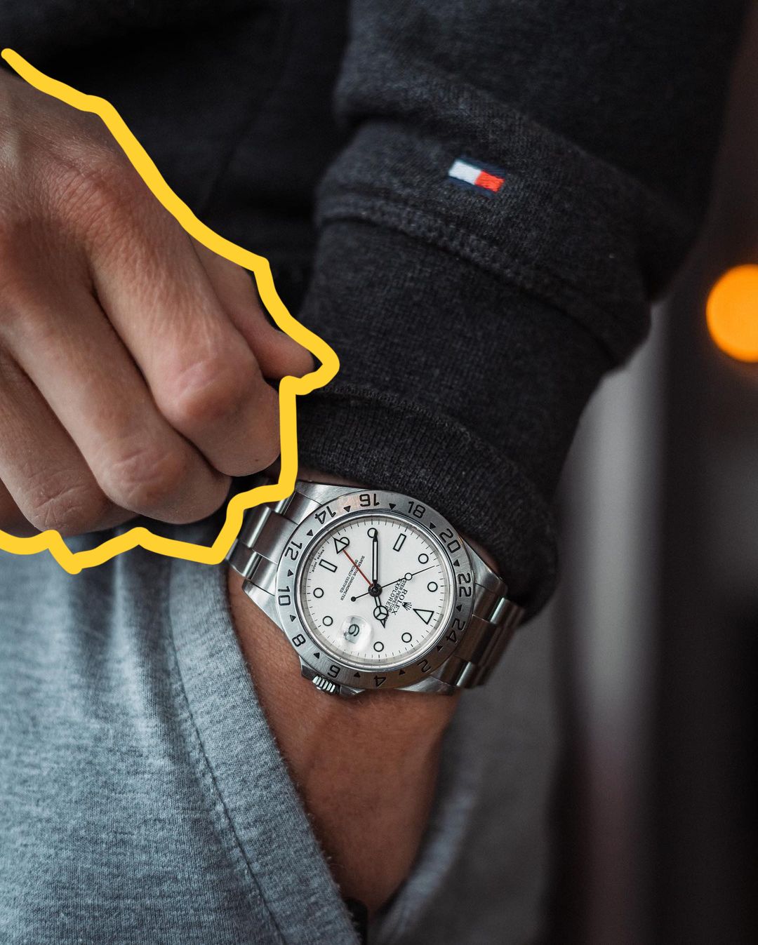
It probably still would have been a good shot even if the watch were centered, but I’ve got to hand it to @herrstilen for making the framing choice that takes this shot from good to great.
Your turn!
Let's see you put the 3 techniques from this tutorial into practice! Or, better yet, share some of the subtle details you employ to take your shots to the next level. Don't forget to tag your posts with #watchstudies to inspire the community!
Thanks for joining this edition of Study Club! If you enjoyed today’s tutorial, you may also enjoy this related content: